Sunday, August 1, 2010

Design Terms


Negative Space:
This picture represents negative space.
The way the white ceramic is in the
jewelry shop has the black behind it
creates that negative space.


Figure Ground:
This picture was taken in the theme restaurant
in Delhi. This has a since that the figure is lighter
and takes up more space. In the background it's
darker so it accents the photo.


Grid System:
This was taken at Whistling Woods film school.
This was a mock up of what one of their new
buildings was gonna look like. The grid is in the
center creating a grid systems.


Hierarchy:
I put this picture as hierarchy because
it shows the monkeys dominating
over the Indians. It is interesting
because they have taken over the
vehicle and it captures a great
moment of hierarchy.


Eye Flow:
This was taken at eye level. It was a counter
at the bottom of Reliant Media. It looks
cool because it continues on and on down
the flow of eye line.


Gestalt:
Gestalt is something that doesn't touch but
creates something else. This her is a view
looking up at a light fixture at Mainland
China. Even though the lights are circles
and they don't touch they still have the visual
of creating a rectangle.


Alignment:
This is a diagonal alignment but if
you look at the columns dead on
then they are aligned with one another.
The go a little diagonal but they still
create a line. This was taken at the
tomb in Agra. It had beautiful
architecture.


Proximity:
I picked this photo because it was
taken in close proximity to me. It
is a close up of a huge elephant.
It was taken outside of are hotel
in Agra. The man was on the street
just walking his elephant and it
came up to us.


Symmetrical Balance:
Symmetry is something that just by
looking at an object you can cut
it and half and it will look the same
on either side just like in this picture.
This was taken at the holy well in
Ahmedabad. It's a shot looking up
through the well.


Asymmetrical System:
It's like being symmetrical but there
is something that throws it off. With
this picture you see the people on the left
and down at the other end. So it throws
the symmetry off.


Scale:
This was a high scale to low scale picture.
I did it so you could see it like a shelf as
the drinks go up. This was taken right
outside of the Marble temple in Mt.
Abu. It's school because you see
the height scale of the drink bottles
and cans.


Unity:
This picture reminded me of unity. I see
unity when I look at it because the flowers
are all coming together and the candle unites
them in the middle. It's like a wedding ceremony
when they light the unity candle.


Contrast:
This was taken at the lake in Mt.
Abu. It was some vendor guy sell
berries and seasons. The contrast
part of the picture are the colors
and the sizes that are involved. It
is also how each one is in contrast
to the other.


Perspective:
This is the perspective picture
because there is a horizon that
is in the middle of the picture.
You eye leads to that point in the
horizon. This was taken at the Agra
Fort across from the Taj.


Point of View:
This would be a point of view picture
because it's my point of view looking
up the stairs. This was taken at the
bottom by the pool at our hotel in
Delhi. It was also cool because it was
night and the lights were glowing.


Mass:
The famous Taj Mahal is my mass.
It is so huge in mass and so beautiful.
This also represents how big it is and
wide it is.


Repetition:
When we were in Jaipur we went to
this palace. In this picuture there
are a bunch of guns that go around
and make a circle. I used this for
repetition because it was being
repeated so many times. One
object made a completely different
shape because of repetition.


Rhythm:
I chose the spices in the market for rhythm.
Rhythm is the way things move or flow together
and what better way to say rhythm than spices.
Each one has to go with another one and some
point in time. So these all being different amounts
creates a rhythm with the picture.


Proportion:
Food proportion is what this picture
describes. the proportion to the table
and the plate with this giant bread
bowl is crazy. Also with the water glass
sitting at the end of the table shows
the proportion to the bread bowl.
Thank you Havmor.


Tension:
This was take outside the palace
in Jaipur. These guards didn't
realize I was taking a picture of
them arguing. This is causing
tension between the two subjects.
It also shows tension in the picture.


Kinetic Sequencing:
On the way to DDB Mudra in Mumbai we
pasted this wall of weird birds painted on it.
First of all I hate birds and second of all I
thought this could be a form of kinetic
sequencing since they all could go together
kinetically and the pattern is in a
sequence of going over and over again.

Ten Beautiful Typography of India


This was the wrapping
paper that was used for our
books that we got as gifts.
I loved the typography
because they were all unique
and all so different from one
another. I thought it was beautiful
because all these different type faces
came together to create pretty
wrapping paper.


This next typography I found to be very pretty
because it was cut out from metal. The cool
part about it was that the sun created a
shadow the reflected the typeface onto the
side of the wall. Everything looked so sleek
and bold.


This word I think may mean butter or the
brand of butter. It looks very elegant and
proper. This was a piece of sheet paper that
went over the butter at the Taj in Jaipur. I
found the typeface to look a little french.


I must say that Ogilvy had a lot of really cool
type in their building. This typeface seemed to
look like a masculine form of cursive. It was
unique how the g drops down and they y drops
down a little lower with a little hook on the end.
Plus we all look good by the Ogilvy sign.


This typography is beautiful because it's
a persons handwriting. It is actually a bunch
of handwriting's. There is always a lot about
someone when they write things in a pretty
way. It just is unique to the person and
it has a lot of thought put into it.


This type was found outside of DDB Mudra in
Delhi. I actually liked the typeface for Lemon
Tree. Something about it seemed so plain and
simple that it was just nice to look at.


Manyavar is a men's clothing store. I saw a
sign for it on the streets of Agra. It was cool
to see this funky and fun type. The M is shaped
like the 3 they use here for their unique language.
This is why they use type like this because it is
unique to their culture.


Jet Viva is a travel brand. I found this in a
magazine. I think it was interesting because of the
curves in the background. I liked how pretty
the font feet looked. Also the way the a and the e
don't meet all the way.


Zeba was on the way to Mudra and I liked
the typography because it really stood out.
It caught my attention in a mess of typefaces.
It looks really modern for it's time.


Mudra also had a very pretty typeface. It was
painted on the saide of DDB Mudra in Mumbai.
It was also one of those things that since it
was painted it looked really authentic.

Feel India Texture...


Texture #1
- This texture is more of an
uneven texture. The skirt in the
picture was found in the market
place in Ahmedabad. It is soft
fabric but with the shinny little
mirrors it creates an uneven texture.


Texture # 2
- This texture was found while visiting
the Reliance Media office in Mumbai. It
is a tile texture with the many different
tiles creating a Monique piece of work.
Even the stones on the side of the tile
have a texture.


Texture #3
- Our last night in Ahmedabad we went to
a traditional dinner. It was really cool because
we got to see them dance and sing. Then we all
sat on the floor underneath this tent. This is
a picture of the side of the tent. It had a rough
texture and it felt a little like burlap.


Texture #4
- This was actually a cool texture. It
looked like fiber glass but it had some
form of plastic glazed on top. It was rough
like fiber glass also. The colors made the
texture stand out a little more I think.


Texture #5
- This is a leather texture. It
was actually a menu for The Green
House which was located in one of
the hotels we stopped at in Old City.
You can tell how smooth it was by
the way the leather hide looks in
the picture. The texture though was
getting a little worn.

Color Your life...


Complimentary Colors:
I found these little chocolates in this
store and they were wrapped in this cute
paper. Red and Green are complimentary
colors because they are across from each
other on the color wheel. They just
happened to sit next to each other on the
shelf.


Analogous Colors:
These are colors that are right next
to each other on the color wheel. I
found this in one of the rooms at
our agency visit. It was cool because
the colors lined up next to each other.


Red- Violet:
These flowers that were on the opening table in
our Jaipur hotel created a red-violet color. It was
very pretty and very bright.


Violet:
This lady on the street was in a violet sari.
The color was very rich and bright. It also had
white stitching in it to help the violet stand out.


Blue- Violet:
These are the water bottle that were given to
us at DDB Mudra in Delhi. The far one on the
left had print on it but I had noticed that the
back ground of the label was a blue-violet
color.


Blue:
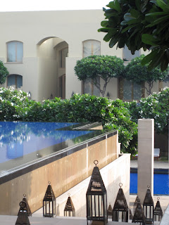
This was a picture of our pool at our
hotel in Delhi. The water was so blue
you can see it from the top level to
the lower level. It's also the tile of the
pool that makes it look so blue.


Blue-Green:
This beautiful skirt was found in the market
around Ahmedabad. The colors are beautiful
and the main color in the skirt is a blue-green
color. It also has little mirrors on it to help the
colors stand out better.


Green:
A natural colors going on here. These
were leaves that were used to make
pallet cleansers after a meal. The leaves are
so green that I thought it was a good
representation of the color.


Yellow-Green:
Well being in India I realized that they love
taking us to malls. It is actually funny because
I have gone to more malls here then I have
at home. This one store in the mall had a
yellow-green ceiling outside the store.
The way the light hit it you could tell
the different tents.


Yellow:
This one woman in the temple was wearing
a very beautiful yellow sari. She was sitting
on the ground of the temple watching her
children play. The yellow in her sari is
so bright and beautiful that it stands out
from all the other little colors around her.


Yellow-Orange:
Our group went to this themed
restaurant one evening and took
pictures around all the bright colored
rooms. This one room the way the lighting
was and the painted color on the way it
looked like tones of yellow and orange
put together.


Orange:
These were the beautiful flowers given
at the Taj hotel when we came in. It
was a hospitality thing. They also were
this beautiful bright orange color.


Red-Orange:
In the first temple we went to we
noticed lots of colors. It was located
in old Ahmedabad city. This man
play an instrument was one of the
sculptures on the side. His outfit
was the tint of a red-orange color.


Red:
First night a MICA and Lexi and I were just
settling in our room. The sheets were red and
the chairs were red and they might as well
have painted the walls red also. Everything
in that room looked red. Even our suitcases
you can't really focus on the color because
there was so much red.